Do you know how to make a website? Contrary to popular belief, you don’t need to pay thousands of dollars just for a website. With the right tools and just a bit of time, you can setup and run your own website using Squarespace. With plans starting at $12 per month and free templates, Squarespace is a great service for business owners who need simple websites that they can put together and manage on their own.We’ve already talked about what your website needs to succeed, but many tradesmen and service businesses don’t have websites to begin with. Given the popularity of social media, it’s easy to ignore traditional websites and focus on your social presence, but the value of a website is undeniable. Social media is limited. The way it works seems to change every month. But a website that you own and operate all on your own will always do what you need it to.In this article, we’re going to show you how to build a website for your service business using Squarespace. It’s a quick and easy process that requires zero technical knowledge. We’ll even cover how to connect it to a custom domain, like the one described in our custom email address guide.
Getting Started With SquareSpace
The first part is easy; go to Squarespace and click on the ‘get started’ button. The site will guide you through the initial steps of setting up a website and selecting a theme. For this guide, we’ll be working with the ‘Pacific’ template, and we’ll use it to create a website that looks something like this:
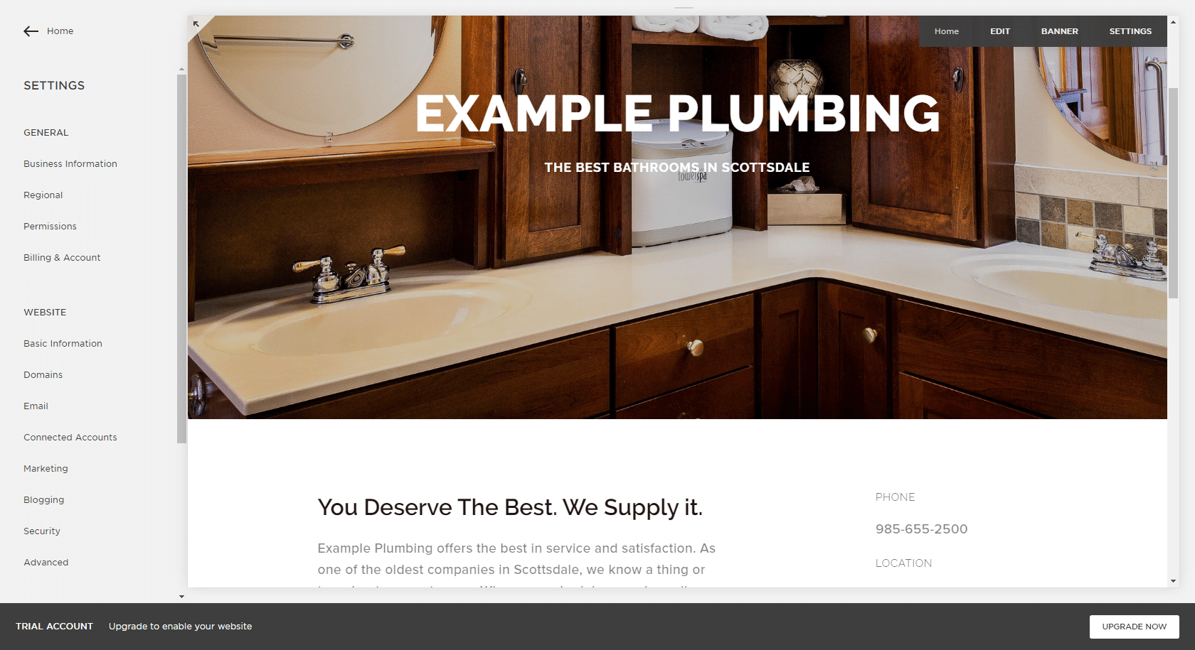
SquareSpace is a great choice for anyone who wants to build a website fast. Compared to other services, the time to deployment is significantly shorter and the tools are more user-friendly. Their themes are extremely flexible (with a bit of digging around) and websites made with SquareSpace don’t have that “this is just a blog” feel that many cheap WordPress sites do.Squarespace uses a visual editor, meaning you can click and drag to rearrange page elements. All you need to do is click on the edit button for each section of the website, and add what you need. Some finer details are controlled through the menus, and it can take a bit of time to figure out how to set up the proper spacers, but most users can build a basic page within a day. The example page we built for this guide took less than an hour.The trick to customizing a SquareSpace website is using their style editor to create a visually consistent design. As always, a conservative approach is best when it comes to web design, so what we’ll be doing here is creating a site that’s simple, consistent, and easy to navigate. We’re going to avoid complex menus, effects, and fonts. We’re going to include all of the information that customers need to know, without anything to get in the way.
Cleaning Up Your SquareSpace Website
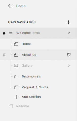
Let’s be frank: You only need a handful of pages for your website. Demo websites tend to have lots of menu items and pages in order to show off how the template or theme works, but real websites rarely need more than a few. For your website, stick to the basics.The Pacific template is a one-page design, and it uses the top menu to scroll views down to the right part. Since you’re running a service business, you don’t need drink menus and restaurant galleries. You should be able to fit that info into a relatively small area.In the left-hand menu, click on ‘Pages’ and then click on the trash can icon that appears when you hold your cursor over the name of the pages you want to delete. Do this for the rest of the parts that you don’t need.
Adding A Custom Domain
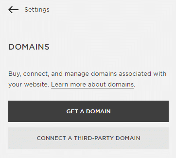
By default, websites made with Squarespace use a sub-domain structure, which can be pretty unappealing. Customers aren’t likely to visit ‘CompanyName.squarespace.com,’ and they’ll be more comfortable with a custom address. We give some great tips on picking the proper domain name in our custom email address article.If you already own a domain, connecting it to your Squarespace website is easy. The exact process is different for each provider, but the basics are the same. All you need to do is copy and paste a couple of values from one page into another, and wait until they’re verified. Check out this guide to get step-by-step directions for almost every popular provider.
Adding Your Web Content
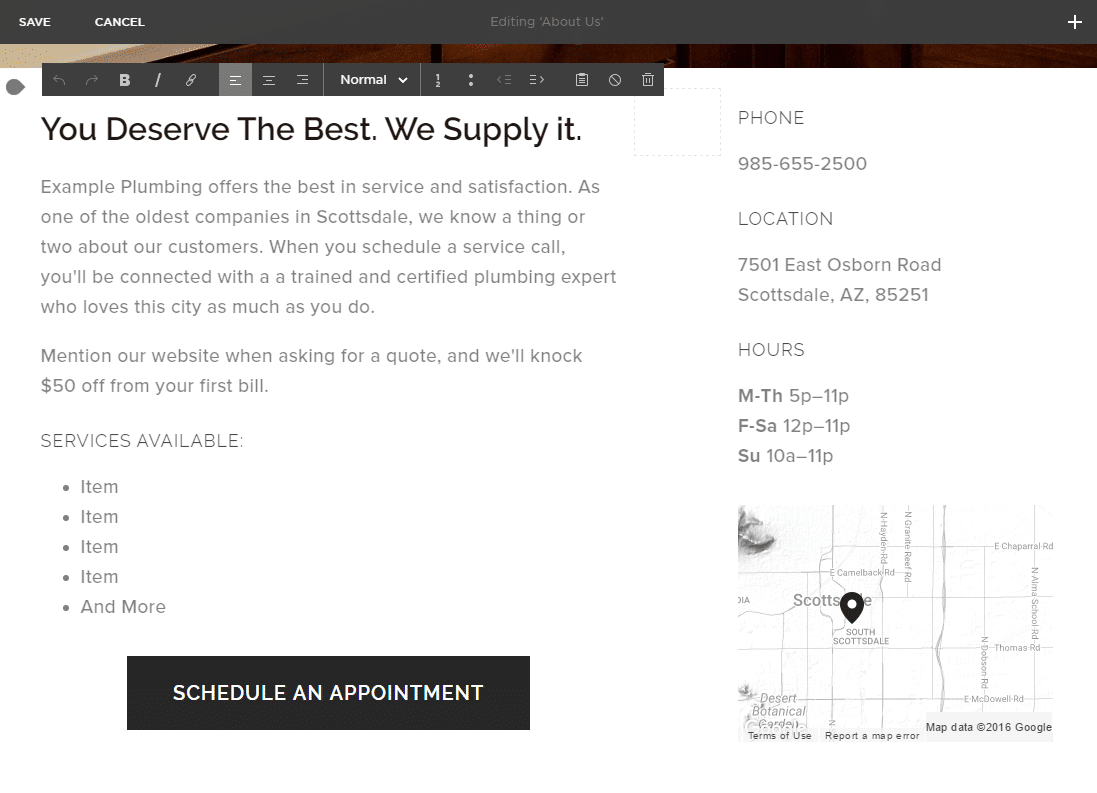
Writing a good company description is an art form. Here’s what you should (and shouldn’t) do:
- Don’t complicate things.
- Communicate value.
- Offer what your customer needs.
In order to do those three things well, you need to understand what makes your business valuable and how to communicate that value using language your customers understand. Pick a trait and sell it, preferably one that your customers have identified in their feedback or testimonials. Highlight the parts of your business that your customers are interested in, and stay relevant.Squarespace uses a visual text editor, so all you need to do is click on the section you want to change and start typing. Instead of letting you select the font through this view, you’re given options for headers, ‘normal,’ quotes and displaying code. The fonts for these text styles are set in the left-hand menu in the styles editor.Don’t pick a ‘cool’ font. Pick one that’s clean and readable. Select a font size large enough that it’s easy to read, and a font weight (how thick the lines are) that’s heavy enough to be read on a cellphone screen (the default font weight for the Pacific template is a bit too light for that). Don’t use comic sans. Don’t use funny colors.
Adding Pictures
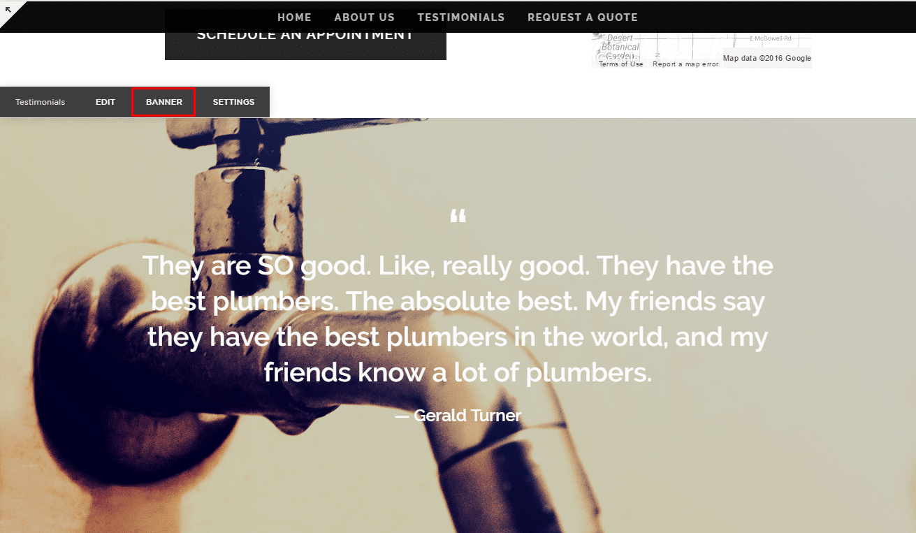
For the example website, we used stock photos from Pixabay.com. For your website, try to use relevant photos that communicate the value of your services. Make sure they’re high resolution, and that they support your marketing narrative. The right images can have a big impact on sales.If you want to add a background image, use the ‘banner’ feature for the page you’re working on. If you have any edits in progress, save them, then hover your cursor over the page you’re working on. You should see the ‘banner’ button in the context menu. Clicking on that will bring you to a menu that will let you upload the image you want.
Adding Other Features
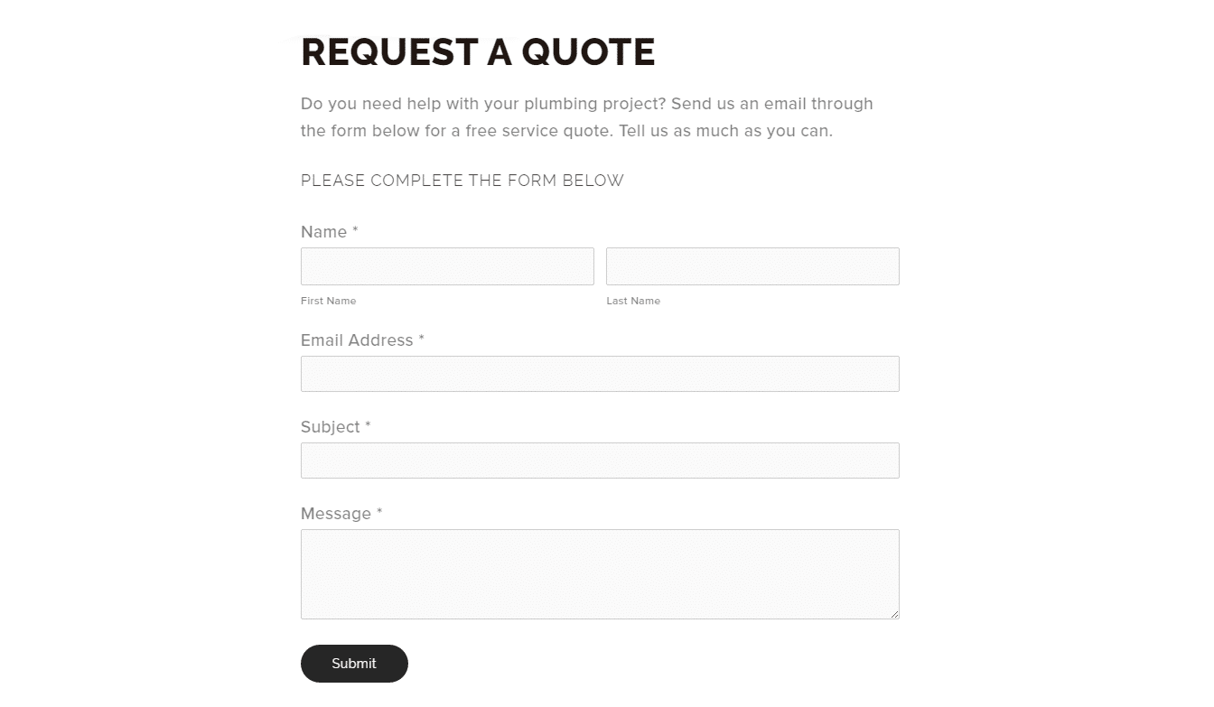
In our example site, we’ve added a contact form. Squarespace includes a wide variety of on-page features, like images, calendars, store pages, media embeds, videos, and custom HTML elements. Adding the contact form was easy; all we did was add a new page, select the ‘contact’ template, and fill in the details.You’ll also notice that we added a button with a call to action right below the company description. This button scrolls down to the contact form, and we included it as a way to encourage customers to engage with the page. It’s similar to the CTA button on Facebook business pages.
Things To Avoid
With the steps covered in this guide you should be well on your way to designing a killer website for your service business. It’s important to note, however, that we’ve deliberately described a simple and condensed design. You don’t need image carousels, background videos, or fancy animations. All you need is what your customers are searching for. With that in mind, here’s a list of things to avoid on your website:
- Nested Menus: Navigating complex menus is hard enough on desktops. Don’t make it harder. If you can’t fit your important pages into your top-level navigation, rethink your design.
- Small Fonts: Small fonts take more effort (and time) to read. They look bad, they’re uncomfortable, and they’re easy to change. Make sure your text is large enough that you can read your content quickly, and that is stands out against the background.
- Autoplay Videos: Don’t use autoplay. Many users will close the page instead of hunting down the video to pause it. Do what’s best for your business and let the customer decide when to start the video.
- Image Carousels: sliders, carousels, and other moving image tools don’t work. They move too quickly for customers to connect with the material, and they create needless clutter.
While it’s important to follow modern design principles, remember that benefits sell better than features. Your website is a sales tool. All it needs to do is generate leads. It’s important to appear modern, as customers perceive newness as a sign of quality, but you don’t need gimmicks or flash animations to do that. All you need is a simple and clean design that loads quickly and looks good on mobile.And with that, you’re done! If you have any questions on the specifics of website design or you’d like to show off your own website, feel free to post in the comments below.
